Thursday, 22 March 2012

Pirate Camp Evaluation!


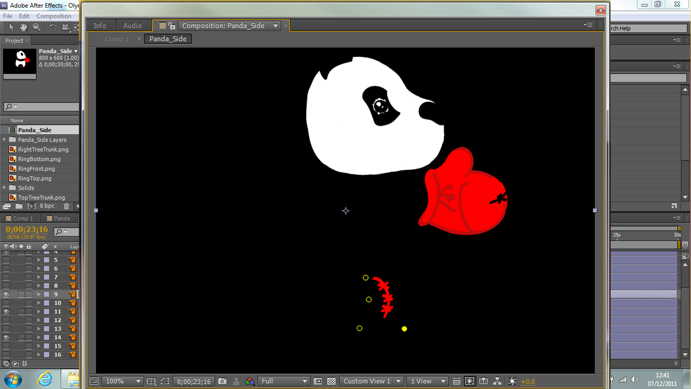
This animation involved creating a pirate camp theme in Autodesk Maya using 3 dynamics or nDynamics.  This program was completely new to us so we practiced basic things first such as using particles by creating weather conditions and fire and using the nCloth attribute. I thought at first that I would struggle modelling the objects themselves but found it to be relatively easy once I had found out where the different attributes were.  I feel that the use of dynamics and nDynamics are very useful for CGI and animation of this nature.  It could also be useful for game environments. 


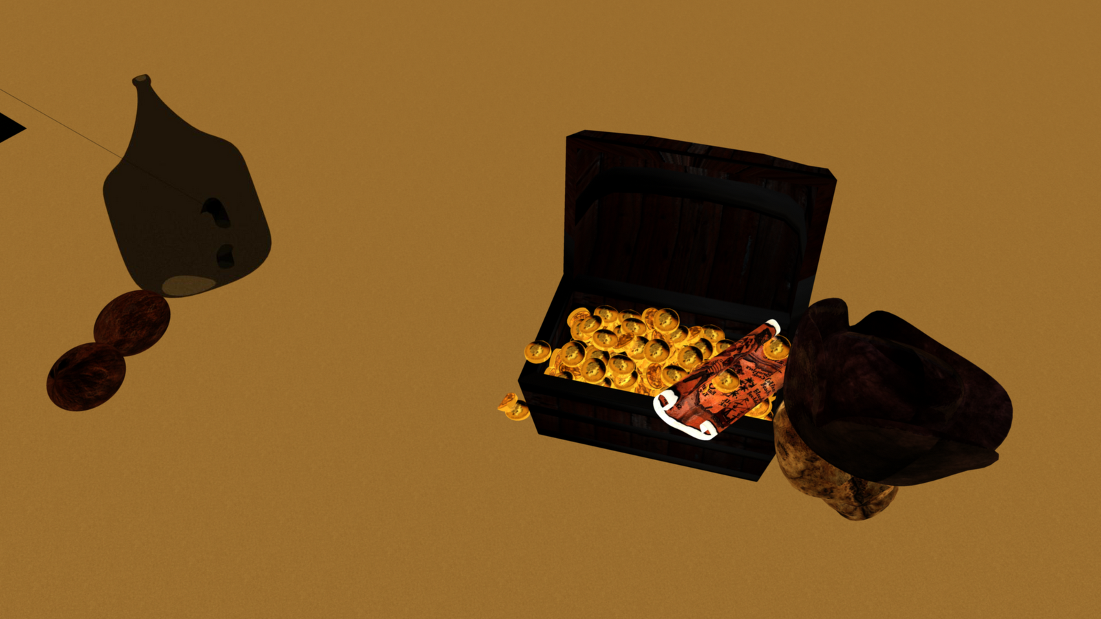
The different things that I had modelled in my camp were a tent, a fire with the surrounding logs and rocks, logs, bare trees, sword, empty alcohol bottle, coconuts, a boat, barrels, treasure chest, skull and hat, a map and a hammock.


For the trees I used the default trees from the program under Visor under general editors then created these into polygon meshes.  The ocean I used an ocean shader texture on a plane.


For the clouds, I used the fluid effect under dynamics.  Other dynamic effects I had used were the fire, the cannon ball blasting out of the cannon as an instancer (replacement) particles and the stream flow on the CV curve.  The nDynamic attributes were the tent opening, hammock, sails on the boat and the flag, all as nCloths.  Another nDynamic attribute was the rain.


The setting I chose to do was a deserted island where treasure had been found by Pirates.  I chose an evening sunset feel where it starts to get cool and I used light rain for the weather.  The rain didn't turn out the right colour therefore I felt that it looked more like volcanic ash rather than rain. 


For the texturing, I chose to use my own textures that I have photographed.  I felt that the UV editor on this program is so much easier as it is fast and you can easily create sections for the mapping.  You can easily assign the textures too and it looks just fine.  The hypershade tool is quite organised although it took me a while how to figure out how to put the textures as a network.


For the lighting, I tried to obtain an evening sunset glow by using an area light.  This worked with just one light but if you put too much intensity on it, it would just look like it was a Summer's day therefore I kept it quite dim.


Rendering in this program was easy in the sense that it is smoothes objects easily.  I didn't at first know where to find the rendering operation to do the whole animation but soon discovered it was the batch render.  I didn't like the fact that you couldn't stop in the middle of a large render or I have not yet found this feature.  The use of having to create settings for each attribute you've used such as raytracing has its pros and cons as you can define how specific things can look to different levels but it is time consuming and I could not understand what each part was for.


In this project, I feel I have learnt a lot in terms of what is needed in industry jobs as this is the program which most companies require you to use.  There is still a lot more I could learn but I feel I have got the modelling and particles aspect of things achieved to a decent standard.  As a basis, I feel using this program as a whole is an advantage and there are certain things that you can do easier than, for example, 3DS Max.  Other 3D programs will now probably be a lot easier to use and navigate.  I currently want to either enter the gaming industry or films therefore this program has helped me in the sense that it is usually a requirement to know. I will now experiment more on this program by trying to create characters and other kinds of scenery.  I would next time take more time on my camera as I feel it wasn't as smooth as it could have been although I did like the camera panning I did for my title sequence.


Monday, 5 March 2012

Location, Location!


For this visualisation project, I will be modelling a scene from a book.  The book I have chosen is The Hobbit by J.R.R Tolkien.  I have chosen to model the hobbit Bilbo Baggins' house.  He lives in a hobbit hole.  Here is a passage from the book that I have chosen to model by:


Page 3

Chapter 1

An Unexpected Party

In a hole in the ground, there lived a hobbit.  Not a nasty, dirty, wet hole, filled with the ends of worms and an oozy smell, nor yet a dry, bare, sandy hole with nothing in it to sit down on or to eat: it was a hobbit-hole, and that means comfort.
It had a perfectly round door like a porthole, painted green, with a shiny yellow brass knob in the exact middle.  The door opened on a tube-shaped hall like a tunnel: a very comfortable tunnel without smoke, with panelled walls, and lots and lots of pegs for hats and coats – the hobbit was fond of visitors.  The tunnel wound on and on, going fairly but not quite straight into the side of the hill – The Hill, as all the people for many miles called it – and many little round doors opened out of it, first on one side and then on another.  No going upstairs for the hobbit: bedrooms, bathrooms, cellars, pantries (lots of these), wardrobes (he had whole rooms devoted to clothes), kitchens, dining-rooms, all were the only ones to have windows, deep-set round windows looking over his garden and meadows beyond, sloping down to the river.


Because the hobbit hole is underground under a hill, there will be a lot of Earthly colours and dull shades which is what I have included in my colour palette.  Bilbo Baggins' is the name of the hobbit.  From his character, he is a very tidy person therefore I have chosen to make the interior very clean cut.  I initially drew out in perspective, what I thought to be the interior described in the book and then discovered an image of the interior in the book.  I will use this as the basis for the character description with the other items placed in the room as these describe Bilbo Baggins' personality and traits.  I will draw sketches of these items and then include them into the interior. 


I will also find other passages from the book that may describe the other half of the room and use my imagination from the character to create this section.  This will ensure that I can show more areas. There is a passageway that leads to the rest of the house and there are no stairs.  I feel that all of the furniture is wooden and he has a fair few chairs scattered around the room as he likes to have guests.  These I feel, as well as the rest of the furniture, will be antique style and have fine wooden carvings.  The shade of wood I will be using for these objects will be Light Mahogany or Dark Mahogany as these shades give an old style finish and feel to the furniture because of the finer streaks within the wood.  I feel that he would have a book shelf full of books as he seems like an intelligent character and somebody that likes to have them to fill up the room.  

The flooring of the room is tiled and flat.  It has a rug in the centre which makes the room look more tidy and cosy.  The structure of the room is a tunnel underground therefore there would have to be a strong structure where it holds extremely well.  The wall panels and the wooden beam structure around the tunnel would do this and it would have to be quite evenly spaced out.  The colour of the wood will be the same as the rest of the room's furniture and the panels plane.  This gives it an antique and tidy look to it which complements the rest of the interior and the character.

This room doesn't have any windows therefore the lighting of this interior would be from what I presume lanterns or more probably candles if the front door is shut as these would be more suited to the time period and style of the book. 

Sunday, 22 January 2012

My Visualisation Project!


 My visualisation project is about still life.  My theme for this project is menswear but I added a narrative to this to ensure that my theme was understood.  The narrative is a business man coming home from work where he places his items after removing them and is enjoying a glass of wine.  I have selected 6 objects to model which are: cufflinks, a tie, a watch, a pair of glasses and a glass of wine and a pen.  With this, I have chosen four sceneries where this narrative could work with an extension in some cases.  The first scenery I have chosen is the table in the living room where the man would place his things.  The next is the bathroom where he could be getting getting ready to relax after a hard day of work and the next is on the sofa being careless and homely where the glass of wine could fall.  The last I have chosen is the bedroom side table where he places his objects just before heading to sleep. 

Next I thought about the composition of these items.  I chose to use the composition of Gerrit Willemsz Heda from his painting of Still Life with a Nautilus Cup from [1645].  This was ideal because of the wine glass that I had chosen to model. I kept the same sort of positioning of items and the angles which means that it corresponds with the style of Heda.  The tie I draped over like the cloth, the angles of the rest of the objects, the positioning of the wine glass and the glasses and watch being slightly off the table.


I found modelling the objects easy as I could measure them and look at them physically.  The texturing to some aspect was easy if the materials didn't need to hold reflections of the environment.  With these I could use my own textures that I had taken instead of the pre-made default ones.  For the cufflinks and tie, I had used the same texture for the material but I photographed them from the box that they came in as the cufflinks were too small.  The watch had taken the longest to model and texture as this has more intricate detail and I had used the UVW Unwrap tool to create the leather straps to make them look right.


I found the sofa hard to model and texture for one of the environments as I had to use the UVW Unwrap tool again to texture it.  This object has more shapes to it which and when I tried to apply any  of the smoothing filters on this, the texturing would shift and not look correct therefore I applied a black background instead of a white one so that it blended in more.


I found lighting the scenery simple to do by changing the colours to the mood and colours that would be there such as a slight blue-ish colour for the bathroom scenery.  I had these environments infront of me to look at which helped a great deal.  The living room table had a window, sunshine lighting feel to it becoming evening whereas the sofa living room environment had an evening spotlight feel.  The bathroom had a blue-ish top spotlight feel and the bedroom had a three directional bulb lighting.


I would improve the modelling of a few of the objects as well as in the environment and use my own metal textures if I did the project again.  I would perhaps work more on some of the shadows from the lighting too as some of them showed to have some jagged edges.  I feel that this project has helped me immensly as I can now model and texture quite accurately which is used as a basis for nearly all virtual environment careers whether it is realistic or unrealistic.


Here is my flikr account with some textures as well as some of the ones I have used.  I couldn't load them all as I used my monthly allowance.  I have organised my photographs into sets.


Monday, 12 December 2011

Fantasy Olympics!


This project is using my skills in Adobe After Effects, Adobe Illustrator, Adobe Photoshop.  We had to create a character playing a futuristic sport for the Olympics.  I first chose the idea of having 5 different characters playing 5 different sports inside each of the rings of the Olympic logo but then stuck to one as this probably would not fit in a 30 second advert.  This animation was 2D and 3D mixed together. I decided to choose the sport boxing and the character of a Panda as this would stereo-typically win a fight of a smaller character.  At first I thought I would create some things in 3DS Max and the rest in After Effects. 


 I found that I first had trouble importing it as the textures would then not import with it therefore I had to recreate the textures in Photoshop and add them in, that way.  I found this way of texturing quite simple and easier once I had finally found out where to do it.


Once I had done this, I found that when importing the 3D object into After Effects, on the main composition, it would then convert it into a 2D object again but with perspective so that it looks 3D.  When you opened the object composition, it would become a 3D object so I think it was just a matter of placing it correctly in there for it to be right in the main composition therefore I left it and had decided to use 2D images of it and create it in that way because the use of transform allows you to perceive it as a 3D object when moving the planes around and connecting them.  I had used a bamboo forest for the environment as well as the design of the tree stumps and bamboo sticks for the boxing ring to give a sense of where an actual panda would live.


I had imported my 2D character into After Effects, I had created a front view and a side view of this so that I could use both in my main composition when needed.  To animate this, I had to use the Puppet Pin tool which allows you to deform the selected part so that it moves.  By having separate layers for each part of the Panda, it was easier to do this and none of the parts would move in unison without me wanting it too.  I had to do it in its own composition which then got imposed into the main composition.  I found this part easy to do. 


 My strengths for this project were creating the 2D elements for the whole animation, positioning them in the main composition and creating a sense of realism for the character using the puppet pins for the movement. I felt that I had created the environment very well and that it looked good by using both realistic images and cartoon images which I had created myself.  The boxing ring itself, I felt I had created well too after having a lot of problems with it.

My weaknesses were that I don’t think I tackled the “futuristic” element very well therefore could have improved by adjusting the sport itself so it would fit within the brief.  I think that I could have added another character into it so that the Panda would be fighting against another.

By doing this project, I am now able to create simple 2D cartoons and advertisements as well as idents.  A lot of animation work in Television and Film has the use of programs like Adobe After Effects in various forms such as the use of CGI or simply cartoon characters.  This means mixing the use of moving image and 3D animation into it too.