Tuesday, 22 January 2013


Tuesday, 8 January 2013
Thursday, 31 May 2012
Character Compositing!
For this project, we had to composite a moving character
into a scene and show certain aspects. I
had to show that the character could reflect on a surface, that a shadow would
move along with it, that the lighting within the scene was correct as well as
the colour and that the character would be completely masked out by one of the
objects in the flat photograph. We also had to make our character in a chrome
material so that it reflected the environment.
The photograph we took had to have two surfaces. The size of my photograph and therefore the
whole animation was 4288 x 2848.


At first, I took a photograph of trees in my garden for the
baby to walk behind but then realised I had no surface for him to reflect on
therefore I chose to do a picnic in the garden for my still image as I didn't
own any toys for the baby to walk through in a scene. The masked object would be the basket where
the baby walks behind. The reflective surface
was the glass of Ribena and the shadow was applied to the blanket on the floor
and the side.


I applied the image in the background and then initially
thought that the image had to be in the background of the renders which at
first confused me and over complicated everything. I then did it so that the background image
was not rendering in the background but could be applied in post
production.
I created objects in my scene that needed to have effects on
them such as the glass, banana, kiwi and basket. They were all basic shapes that could be
applied. I then used the matte/ shadow
reflection material to these objects but as I didn't want reflections on
everything, I made two versions of this material and switched off reflections
on one of them. I also created the basic
chrome material from Arch & Design and then applied this to the baby.
After, I went to the Environments options and mapped out a
environment/ background switcher. This
was applied onto a separate material slot and onto the camera mapped background
slot in the matte/ shadow/ reflection material.
This meant that these would not show in renders but mean that it would
register that these objects are still there.
This also means that the environment would be shown as a reflection on
the chrome baby.
I had to then add lights.
I used photometric lights which meant that it would be more useful for
the environment settings. I at first
thought I had trouble using these but it was the fact that I switched on the
matte/ shadow/ reflection material as the shadows were not showing anywhere or
even in the alpha view. I quickly sorted
this out by switching it off. For the
lighting, I used my camera settings for the lighting which was:
- Shutter Speed 1/
400
- Aperture f/8
- ISO 700.
I also adjusted the settings of the highlights and midtones
as these made the image far too bright therefore I decreased them till it
looked right. At first I was going to
use unitless 80000 to show the effect of sunlight but this option made the
render not show at all. However the Physical Unit option allowed it all to
show.
Next, I sorted my character out by creating a walk cycle and
adjusting his position so that he started off screen. His reflection on the glass was still visible
at this point so I knew it was working.
I gave him a standard straight walk cycle but decreased the actions as
they were over-exaggerated. This made
the walk cycle more realistic. I also
had to decrease the sort out the end time and the maximum step time so that the
baby would finish walking past the basket in the time frame.
Once the five second sequence was rendered, I imported them
into Adobe After Effects. I had to
render the sequence as pngs as these was the only file format that would allow
the baby to save the alpha and not have a black background even when adjusting
the settings. I also added some Z-Depth
to this sequence to practice it and to show that the still camera would need to
focus. These were exported as exr files
and imported as straight - unmatted. Once
completed, I decided to downsize the render as the original size would not fit
the monitor. I reduced the size by two
thirds as this seemed like a suitable size and almost half HD.
This project has enabled me to get a better understanding of
the film and game industry as by doing things this way, it can save a lot of
time and rendering if you use real life still images or video sequences (which
goes onto a more complex area) instead of creating everything from scratch in
3D.
Effects Compositing!
For this project, we had to demonstrate compositing skills
by piecing together rendered elements in a suitable order and applying creative
effects onto them. I found this aspect
easy to do as it was a lot like using Adobe Photoshop but key-framing it which
is what I am used to. We had to use a
minimum of four creative effects.
At first, when importing the different rendered parts of the
sequence, I felt confused as I initially thought that there were parts
missing. Once I had looked at the
different importing settings for alpha using tga files (ignore, straight -
unmatted and premultiplied - matted with colour), I had finally achieved
finding all of the sequence files and importing them all correctly. This enabled me to re-order them so that
they made a mini clip of a city with aircrafts.
The Beauty Windows layer were not in sequence with the rest of the
layers therefore I decided to split these up and adjust it so that the timing
was correct. I noticed that there wasn't
a background for a sky therefore I had used my own sky image which has an
orange colour to it. I immediately
decided to use this as a theme for the city which leads me on to my first
creative effect I used.
My first creative effect I used was colour finesse. This enables you to re-colour elements of the
sequence by picking out colours to change.
I used the full interface of this as it was a lot easier and had more
options to use such as the secondary colour option where you individually pick
different colours in the given scene and you can do this for a lot of the
scenes. I decided to give my city an
evening orange/ red/ yellow effect which coincided with the cloud
background. This gave the city a
completely different look and made it more calmer and serene.


The second creative effect I used were both glow
styles. One was a layer effect and the
other a transitional glow. I used these
to enhance the effect of the trail. This
gave it a stronger glow to it and it differentiated the trail from the car
lights.
I applied the Z-Depth to the different layers such that
needed it such as the billboards layer, city layer and city extra layer. This meant that it provided depth of field
and you can transition between the blurring of the layers. Although this aspect takes up more rendering,
it is a useful tool to use as it gives things a more realistic look by not
always being fore fronted in the camera's focus. I had to apply the camera lens blur onto its
corresponding layers and map it to the Z-Depth layer then sorted its features
out by adjusting the Blur Focal Distance and key-framing it where
necessary.
Next, I applied CC Light Rays and Lens Flare to the
billboards as this enhanced the features of them being screens and to exaggerate
them more. The Lens Flare showed the
aspects of there being sunshine somewhere in the scene.
This project has given me more insight into compositing and
enhancing each animation I do especially in terms of the Z-Depth and colour
enhancing. It has made me realise that
within the games industry or the film industry for example, I will have to use
these aspects to make everything look more "spot on" therefore I will
be taking more time in using After Effects and creative effects to ensure that
my animations look to a professional level which is what these do.
Sunday, 29 April 2012
Location! Location!
 This project entailed us to recreate a scene from a book
description. I chose The Hall of Elrond
from The Lord of the Rings. I had
changed this from The Hobbit Hole from The Hobbit and then from the Dragon's
lair from the same book. I then went on
to sketching ideas as well as a perspective sketch {to both be scanned in and added} of what it would look like from my imagination rather than
from the films which helped me design everything in 3D. I knew that the setting was from the fourth
age so I looked at old styles of buildings, furniture and cutlery which helped
me again to design objects to place into the interior. I created mood-boards of my findings. The description included things such as the
great chair for Elrond sits on a dais, a chair where a woman sits under a
canopy, against woven cloths upon the wall and at the time, they were at a
feast therefore I set it just before the feast.
The interior would be fit for a king therefore I included other aspects
such a large painting of the king, fire places behind the great chair and
candle chandeliers. In another scene,
they were entering another room and it describes the type of doors. I also put a theme of red and beige marble to
fit this theme. For more inspiration, I
looked at church interiors as I decided that it would replicate this quite a
bit.
This project entailed us to recreate a scene from a book
description. I chose The Hall of Elrond
from The Lord of the Rings. I had
changed this from The Hobbit Hole from The Hobbit and then from the Dragon's
lair from the same book. I then went on
to sketching ideas as well as a perspective sketch {to both be scanned in and added} of what it would look like from my imagination rather than
from the films which helped me design everything in 3D. I knew that the setting was from the fourth
age so I looked at old styles of buildings, furniture and cutlery which helped
me again to design objects to place into the interior. I created mood-boards of my findings. The description included things such as the
great chair for Elrond sits on a dais, a chair where a woman sits under a
canopy, against woven cloths upon the wall and at the time, they were at a
feast therefore I set it just before the feast.
The interior would be fit for a king therefore I included other aspects
such a large painting of the king, fire places behind the great chair and
candle chandeliers. In another scene,
they were entering another room and it describes the type of doors. I also put a theme of red and beige marble to
fit this theme. For more inspiration, I
looked at church interiors as I decided that it would replicate this quite a
bit.


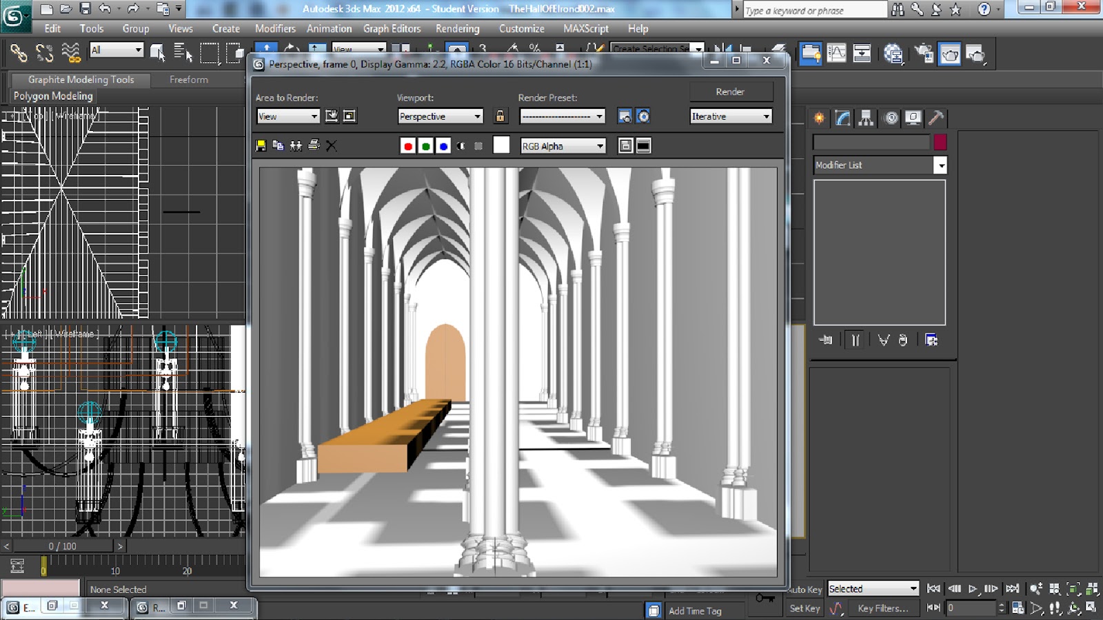
At first, I had practiced modelling several things and some
of these such as the vaults and the columns which I then developed into the
rest of the interior and I included in the design as these were very similar to
what I had designed for my interior. I
then looked at the design of the chairs I had created and modelled these as
well as the cutlery. The modelling of objects
I found very easy to do as I've had a lot of practice to do this. I used other techniques from previous
projects to model these such as the lathe modifier for the goblets and plates
and new techniques such as the loft tool for the chairs.




After modelling everything, I applied textures. I used the textures which I had photographed myself
apart from the painting of Elrond. I had
used the channel mixer on Photoshop to apply different shades of the same
material such as the marble and the wood.
I found the texturing easy to do although I feel I should have perhaps
altered the marble effect on the stained glass frames and fire place frames a
bit more to make it accurate. I also
feel I could have made my own stained glass design as I used one from the
internet.


For the lighting, I wanted to achieve an evening glow with
mainly firelight. I feel I could have
used more of a moonlight feel through the windows but this wasn't so much of an
issue. I had used a lot of lighting and
I should have used a volume effect for a natural glow. I should have also used Final Gathering which
I had applied on my still renders rather than the clip as this showed better
lighting and it looked more finalised.
This however would have taken a long time to render and it was already
taking between 3-9 minutes per frame depending on the scene. I reduced this problem by reducing
reflectivity on the marble effect as this caused it a lot. I feel by doing this, the reflections looked
more realistic and I compared it to my own fire place at home which is where
the texture was taken from initially.


The rendering of this project took a long time and I had to
use 2 machines and cut some scenes short so that it would be done on time. The end result however was still visually
done well and I am satisfied with it. I
will need to find out ways to shorten rendering times but maintain a high
quality for future projects of a similar nature.

Monday, 16 April 2012
Silent Comedy!
This project was to create a character rig. First I had thought of two characters being a baby and a boy and then had written a beat script which allowed me to create a storyline around it:
Silent Comedy Beat Script
1. Boy and baby watch telly in a cardboard box;
2. The cartoon on the television is of a rocket in an asteroid belt;
3. Boy imagines that he is in the asteroid belt with baby so they start to pretend that the box is a spaceship;
4. They are avoiding the asteroids;
5. Meow!
6. A cat is strolling around the living room;
6. Baby becomes fascinated by this;
7. Giggle!
8. Baby attempts to come out of the box/ rocket;
9. Rocket wobbles and goes out of course in the imagination events;
10. Baby is determined to come out;
11. Baby walks to the other side of the box;
12. Boy realises baby is about to fall out and is scared
13. Baby slides out of the box
14. Crash!
15. Spaceship is toppled over and hits an asteroid;
16. Boy looks over with a frown;
17. Baby is over in front of the cat;
18. Giggle!
I felt that the beat script helped me a lot in shaping out my project. I designed the two characters. The character of the boy had been originally been designed by my friend then I changed it a bit so that it would work for the project and the theme. I had added a mouth, nose, hands and shoes.


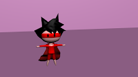


My second character I completely designed myself which was of a baby. I wanted to give this character a cute feel as I feel these work more successfully and can more of a feel of humour into it. I feel I should have made the eyes larger to achieve this even more.


Using Mudbox I feel was very useful if I wanted to change clothing styles. I decided to use this rather than use the material editor in 3ds as I could add a bit more detail onto it such as the nappy without having to edit the polygons too much.


After that, I modelled both characters in 3ds Max using a T-pose which is standard to be able to rig it to a good standard. This was the part I felt comfortable with doing as I had practiced this a bit over the Summer for a few other projects. I rigged the characters using CAT rigs and shaped the bones within my characters. I had to do this twice as I did not shape the bones accordingly the first time. This worked out well but when it came to editing the envelopes, I found this to be troublesome and judging from my final piece, I didn’t do it very well as there are parts of it that are still creasing wrong such as the shoulder of the boy towards the end when he falls over. I feel I may have had to edit them further during the animation process. I think there are other things that needed further research which make the bones attached to the muscle better as my arms and legs for my character are quite wide.


I started to animate the characters and create my storyline. I was comfortable doing this as I think some of the timings could have been smoother and I should have shortened the length between some of the actions to make it flow better. At certain points such as the blinking, I did these parts well.


Although the brief says to add only two characters, I also added a CAT rig to the cat as I needed something mobile to be a distraction for the baby. This didn’t at all look smooth even though I had mesh smoothed it and edited the envelopes. The envelopes on this for some reason were flat therefore did not cover the whole mesh properly. To make the cat mobile around the room rather than in a straight line, I had added a standard walk onto it and then I needed him to pause in two places and start moving again. I had to add both a standard CAT animation and a normal animation layer then play around with the Global Weights for both which allowed me to start and stop the rig. I had to do this for the baby too so that I could have two styles of action. I also added a path node onto the cat which is what allowed for the cat to walk around the room rather than in a straight line.
Both the baby and the cat have both CAT animation and normal animation layers as they needed it. The boy was mobile in the box and he was imaginary driving. I should have had him gripped onto a toy wheel to show that he can pick an object up. On the boy’s cape, I had used a wave modifier and attached it to one of the bones. I should have used the wave and moved the cape as a separate element to make it more fine-cut and so that it did not go through his arm or the box. The wave itself worked well by making it look like it was flowing.
My environment I created was all parts of my old pieces of work. I had just imported them and used some of my own textures I had taken and quickly applied them which allowed me to spend less time on the environment but still make it work successfully. I used After Effects and Illustrator to create the outdoor scene and the space/ alien part by using the skills I have used previously.


In conclusion, I feel that I need a lot more practice with character rigging and I think it will be useful for me to know as the gaming industry and film industry use this a lot and having skills in all areas to a good enough level is probably required in industry in case you have to change what you’re doing. I would fine tooth the actions and sort out the envelopes to a better degree. Some of the positions of things I would have also fine toothed such as the cape, the baby and the boy all in the box. The parts I did achieve successfully in this project were modelling the characters, rigging the baby, creating a good flowing storyline, the path node, the morphing of the baby and the boy and applying sound effects in the right places.


Subscribe to:
Posts (Atom)